Student organisation · Website redesign
Revamp Website Himalkom IPB
Redesigning the Himalkom IPB website with a responsive experience across desktop, tablet, and mobile.
- My role
- Lead Designer · Head of Media and Branding Division
- Experience
- Web & digital
01 / THE STARTING POINT
A website shaped around its organisation.
During Himalkom’s CONNECT cabinet, I served as Head of Media and Branding (Ketua Media dan Branding) and led the website redesign.
I guided the design team and collaborated with the Riset dan Teknologi (Ristek) division, who would develop the website. Together, we connected the design work with the implementation ahead.
THE PEOPLE BEHIND THE WEBSITE / KABINET CONNECT
Leading the design. Building it together.
Lead the website redesign.
As division head, I led the design process and coordinated the team from early ideas through the final screens and prototype.
Bring the website into development.
The Riset dan Teknologi division would act as the developers, using the designs and prototype to build the website.
02 / THE DESIGN PROCESS
From a shared brief to a shared direction.
STEP 1 / 6
Start with the organisation’s needs.
I led discussions with Himalkom’s leadership to identify what the new website needed to support.
An agreed starting point for the redesign.
These needs became the input for our team’s explorations.
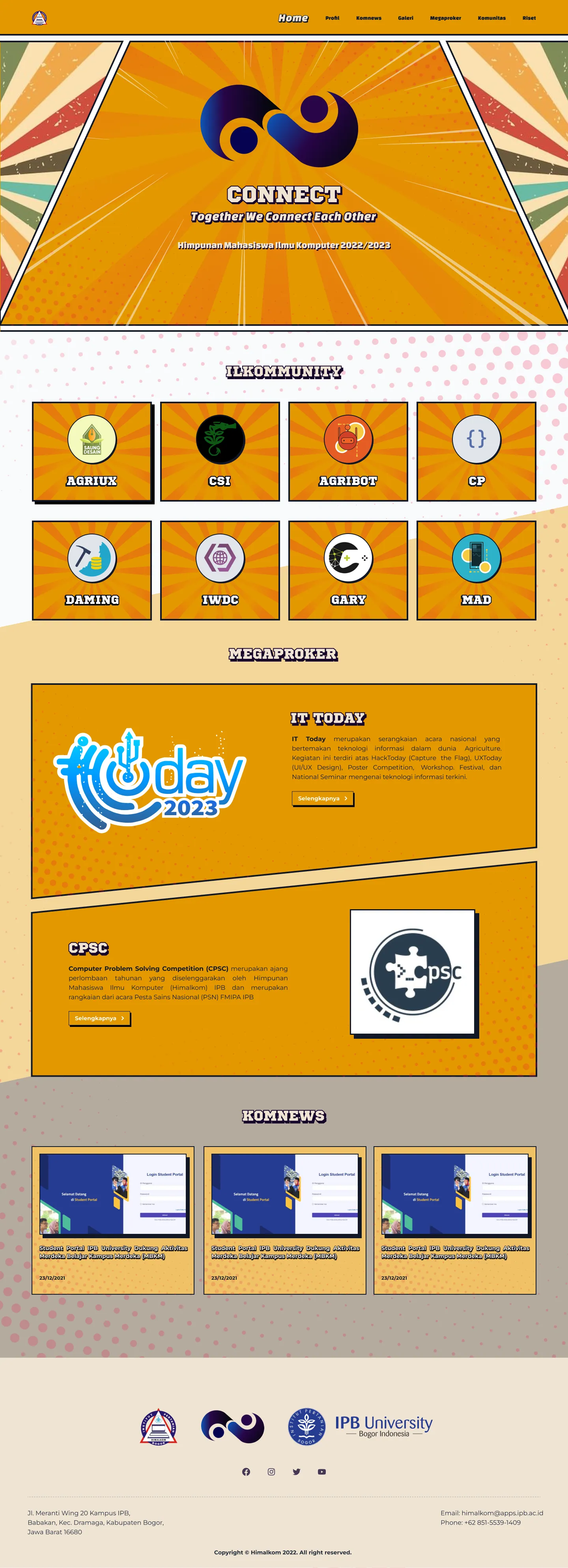
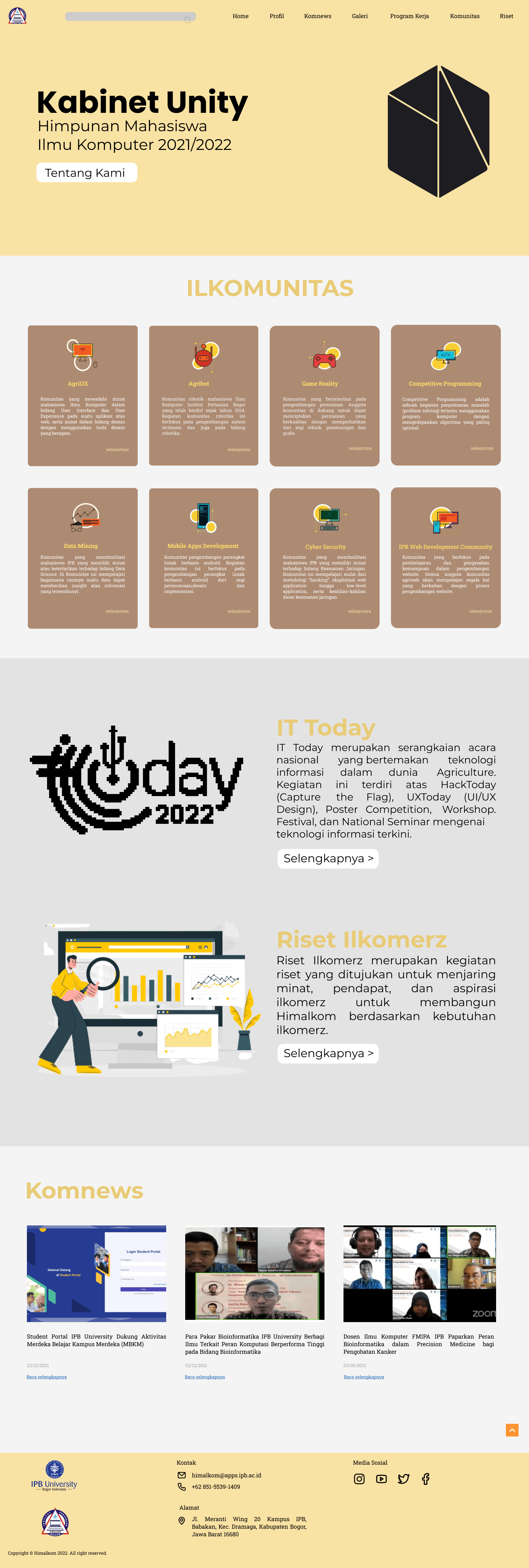
THE REDESIGN / BEFORE & AFTER
Bringing CONNECT into the website.
Drag the slider to compare the previous website with the redesign.
03 / EXPLORE THE DESIGN
One identity. Different places to explore.
Choose a page, then scroll inside the screen to explore the original design.
PAGE 01 / 08
A first look at the community.
The landing page brings communities, major programmes, and recent news into one starting point.
How to explore
Start with a community or programme, then explore its dedicated page.
04 / VISUAL DIRECTION
A bold identity, carried across the website.
The comic theme came from CONNECT’s existing cabinet branding. We carried that identity into the website through illustrated backgrounds, expressive headings, golden yellow, and deep purple.
A CLOSER LOOK / DESIGN DECISIONS
The details behind the direction.
Choose a detail, then tap the marker to open its note.
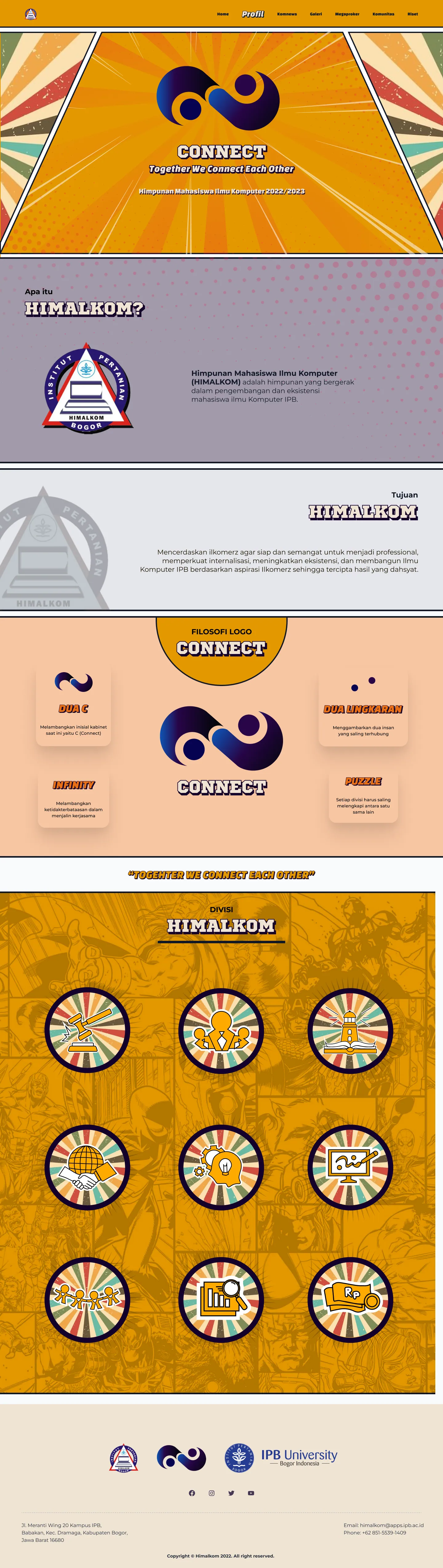
01 / CONNECT identity
Carry the cabinet’s identity into the website.
The comic direction follows CONNECT’s existing branding. The logo, illustrated backgrounds, and expressive headings carry that identity across the pages.
Explore the original design presentations
05 / HANDOFF & REFLECTION
A design handed over.
A lesson taken forward.
I led the UI design and prototype with Media & Branding, then handed the work to Ristek for development.
- 01UI designMedia & Branding
- 02PrototypeMedia & Branding
- 03DevelopmentRistek
NOTES FROM THE COLLABORATION
The visual assets were difficult to implement. Ristek faced challenges translating the illustrated design into a website.
Despite the difficulty, Ristek liked the design and saw it as an opportunity to add the work to their own portfolios.
Check complex assets with developers earlier, so the visual direction and implementation approach can be shaped together before handoff.
THANK YOU FOR READING